Start-up's golden triangle of customer loyalty - cohort analysis Part 1
If you're from a financial or medical background you'll probably already be familiar with cohort analysis but more recently it's become a very popular way of measuring customer loyalty among your consumers. I've been playing with it with our customers for a while now and I think many more businesses can benefit from it's insights.
Once you've worked out the customer's lifetime value (often referred to as LTV), average order spend and time until first purchase, your analysis often end there. LTV is better than nothing however you may be missing some major issues in their journey. Lets for example say you sell a widget. Your widget lasts 12 months but needs to be oiled every 3 months. Your gut tells you that this is the case but proving this is difficult without analysing each client individually.
Individually you can't gain a great insight into your customer as each is slightly different. Cohort analysis works around the granularity and groups customers together into cohorts. Each cohort is based on a fixed point in the customer's timeline with you -for instance the date/time they signed up or their first order. We can then use this fixed point to compare other customers who have gone past the same period in their lifetime (or not as the case may be) to spot trends.
The easiest way to understand you group the users is to imagine the following timeline of customer signups, we have three customers (Green, Blue and Red) and they all signup up at different times throughout a 6 month period:
Spotting trends in these customers is less than obvious however all customers have passed through a number of similar points in their lifecycle (in this example month 1, month 2 and month 3) so looking at the data from this perspective will help you spot the trends:
Most cohort analysis groups customers into monthly groups however the size of each group will depend on the number of signups/orders you have e.g. a system like Twitter will have enough data to produce cohorts on a minute or even second basis. By grouping customers together in this way you can then spot seasonal trends and retention (the length of time you keep a customer).
What does a cohort chart look like?
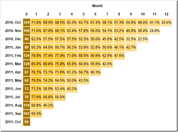
A cohort chart looks like this:

You get this very distinctive triangle because the users on the first row are your eldest users and will have been with you for the longest time (which is also why they have the longest row). The users on the last row have just joined in the current month so have the shortest row.
The chart above is rather encouraging; it's from one of our e-commerce clients and it shows really a rather dedicated customer base -a year after signing up 41% of the customers are still logging into the system!
You may also notice an interesting dip in retention for those customers who signed up in Dec 2010/Jan 2011. Although additional investigation is required, the type of customer base they have is very busy during these months so they've probably forgotten about signing up. This does however leave a prime opportunity for them to be contacted directly and encouraged back.
In my next cohort analysis blog post I'll overview how you can read and interpret the chart in more detail and use it to spot trends.

Liked this post? Got a suggestion? Leave a comment